Overview

LinkedIn launched in 2003 as a professional networking and career development hub, but its magic has faded — with job competition at an all-time high, “networking” has become a superficial feature, and job seekers are left applying to hundreds of roles with little to no feedback on how to close their skill and experience gaps.
LinkedIn Mentorship reimagines networking through a redesigned profile page ecosystem where job seekers can book 1-on-1 sessions with accredited industry professionals for career advice, portfolio reviews, and open Q&A — turning networking from a passive feature into real, actionable guidance that makes candidates more competitive in their search.
*All information in this case study is my own and does not necessarily reflect the views of LinkedIn.
Product Film
The Challenges
Meet Sam and Alex
Two personas shaped how mentor credibility and scheduling needed to work.

Sam
Pain point
Determining if a professional is influential and credible in their space, and closely affiliated with their industry peers.
When I view someone’s LinkedIn profile to see if they can help connect me with an opportunity, I want to determine if they’re credible on the spot, so I only connect with the right people.

Alex
Pain point
Difficulty and inconvenience scheduling a virtual meeting with the professional.
When a person accepts my invitation to have a conversation, I want to schedule a call as soon as possible, so I don’t miss out on a job opportunity.
Success Metrics
Project Impact
Talking to people: user research and user testing
Research
The real impact of this project came from the conversations I had with participants throughout. Talking to job seekers new to an industry — my target user group — surfaced a real tension: the threshold for entry keeps rising, yet many jobs are surprisingly left unfilled.
That gap led to the solution: a mentorship platform built into LinkedIn, where mentors give juniors career advice through 1-on-1 and group sessions, virtually.
Testing
Two stages of user testing showed that integrating a new ecosystem into an established platform like LinkedIn means reckoning with three things at once:
- Seamless integration alongside LinkedIn’s existing features
- Access model — set as a Premium member product in this case
- Competitive positioning — how LinkedIn Mentorship ranks against alternatives
Those conversations, across both phases, shaped a final product that addresses all three.
KPIs to Track
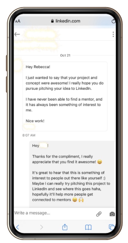
All successfulResults from the latest round of user testing
- Participants understand how to search for a mentor on the platform.
- Participants find it straightforward to check the credibility of a mentor.
- Participants understand how to select the skills they want to be mentored in and connect with the mentor.
- Participants know how to check the status of connection requests sent to mentors.
- Participants know how to manage bookings with mentors.
- Participants understand how to join a scheduled meeting with a mentor.
- Participants understand how to join a group mentoring workshop.
- Participants report satisfactory comments on using the product and each individual feature.
*Please refer to Final Thoughts for KPIs to track for real users, should/when this product launches.
User Research
User Interview
For my user research, I decided to conduct a semi-structured user interview with my participant. Through speaking with my participant (a UX student looking to enter the UX field – a new space for her) in the interview, I learned that in her case, she’s experiencing this concern of not knowing how to approach and/ a new career like most of my other users I’m targeting for this project.
After the user interview, I noted all the important and/ interesting points that the participant mentioned during the interview by listening to the entire audio recording of the conversation.
Affinity Mapping
This video shows my research synthesis process for my user interview responses by conducting an affinity mapping activity to identify the themes, which in turn helped to write the problem statements for this project.
Affinity Mapping Activity
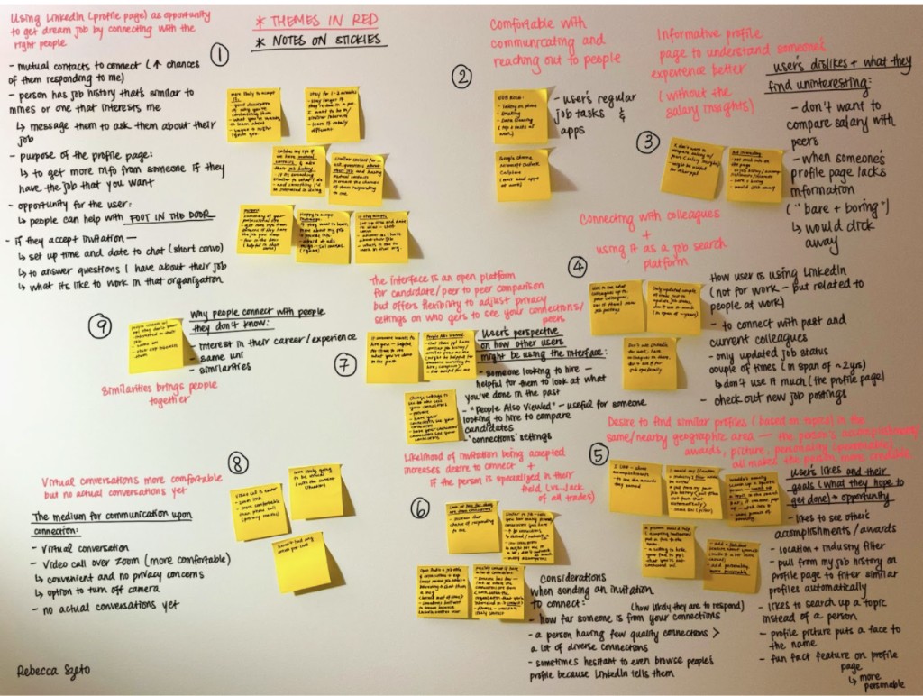
For my affinity map, I’ve identified 9 unique themes in my participant’s responses, which I in turn transformed into 9 unique problem statements that I believe my target user group are facing.
Problem Statements
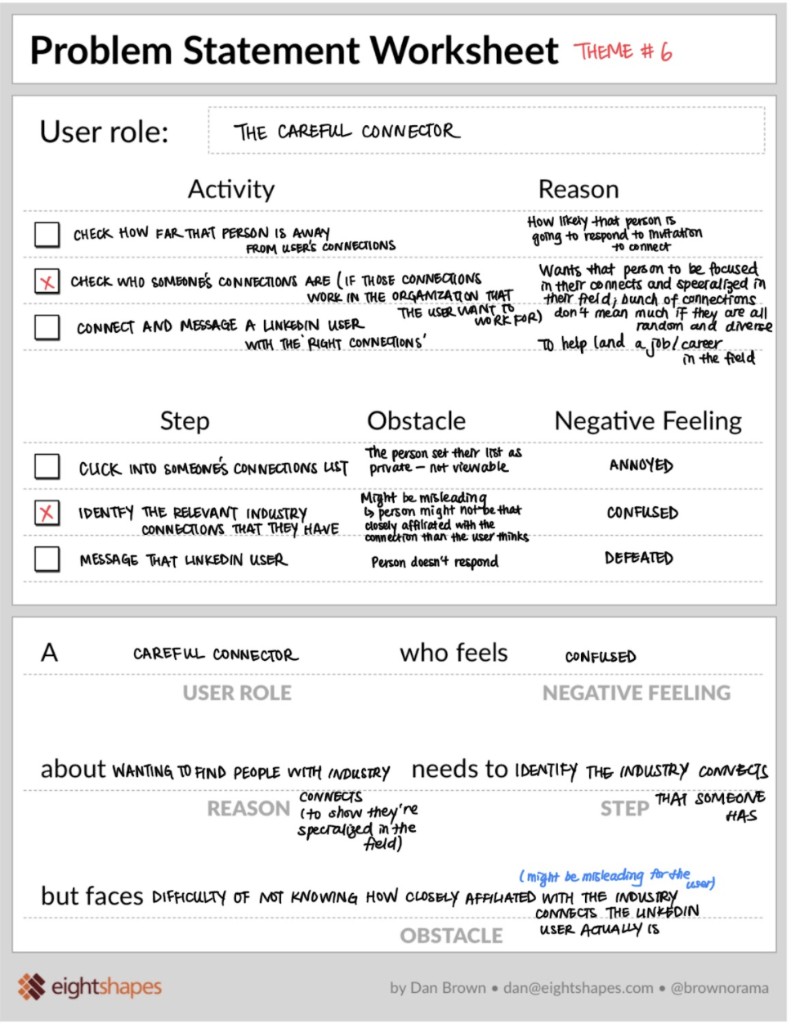
The Careful Connector
The user wants to be sure the professional they’re connecting with is credible — including how closely affiliated they are with their industry peers — but it’s hard to tell from the info on a LinkedIn profile page alone.
A Careful Connector who feels confused about wanting to find people with industry connections needs to identify the industry connections someone has, but faces difficulty knowing how closely affiliated those connections actually are — the profile can be misleading.
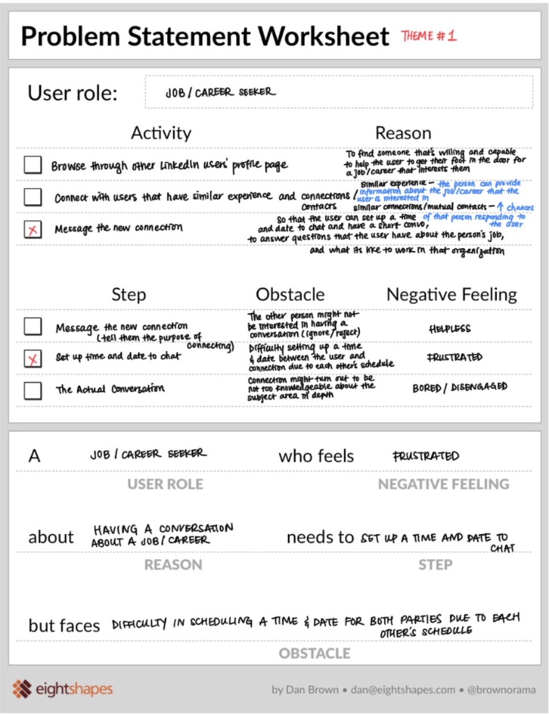
Job / Career Seeker
The user wants to message their new connection to set up time to chat, learn about the industry, and ask questions — but on LinkedIn today, that takes a lot of back-and-forth over each other’s availability.
A Job/Career Seeker who feels frustrated about having a conversation about a job or career needs to set up a time and date to chat, but faces difficulty scheduling a time that works for both parties.
UX Research Final Presentation and Workshop Plan Proposal
This is a video of me presenting my UX research process and workshop proposal plan to the class and the instructor. See how I answered a thought-provoking challenge question pertaining to team collaboration between different team members from each department towards the end of the video!
The Workshop
(I executed the actual workshop outside of class – here’s the intro:)
A workshop video executed according to the workshop plan proposed in class. The actual execution of the workshop wasn’t required, but I decided to take this on outside of class to have it as a learning experience.
Divergent Game
Here’s the Divergent Game to get the entire project team (imaginary – it’s just me and another person!) to brainstorm all the possible challenges of the current interface and possible solutions.
Whiteboard Challenge
Sharing and Collaboration Ideas from the Challenge Cards Game – 20 Minutes Whiteboard Challenge!
Crazy 8s Workshop
(Creative Brainstorming – An Agile Design Sprint)
I like that the Crazy 8s Workshop forces me to not be fixated and attached to only 1 or 2 solutions during the entire session. The limited time that I have on each frame (1 minute each) naturally pushes me to the next frame once the 1 minute is up. No matter how good I think an idea is, I move onto the next one without dwelling or perfecting on any specific solution.
This allows me to consider alternatives, to come up with as many different ideas as possible under the time limit, and most importantly, be open minded to different possibilities when quantity is a requirement and not an option.
Crazy 8s Sketches


Summary of Sketches
Signaling Credibility
Experience & verification badges
Icon badges on a profile flagging experience level and verification status.
Meter of interaction
Chat activity mapped into a meter reflecting engagement in their UX/field.
Events attended
Surfacing a mentor's activity through events they've attended.
Industry connection count
Shows the number of industry connections someone has in a given field — e.g. "UX — 42."
Calendar & Communication
Access to calendar
Password-protected calendar access, directly from the profile.
Tap to notify
One-tap notification, governed by preference settings.
Integrated video chat
A built-in video chat system rather than linking out.
Resources in chat
Sharing resources directly within the chat thread.
Presenting my 2 Design Problems to my Classmates for Our Crazy 8s Sketching Workshop
Userflows and Sketches
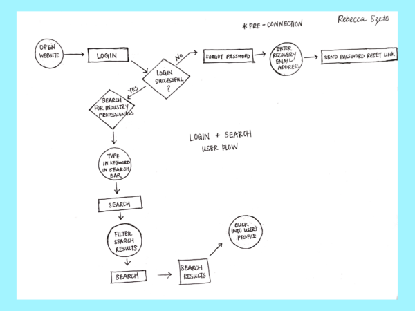
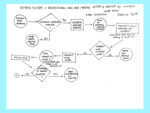
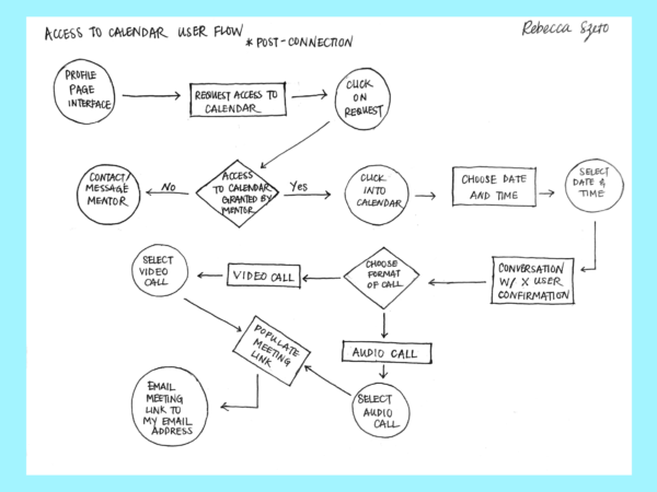
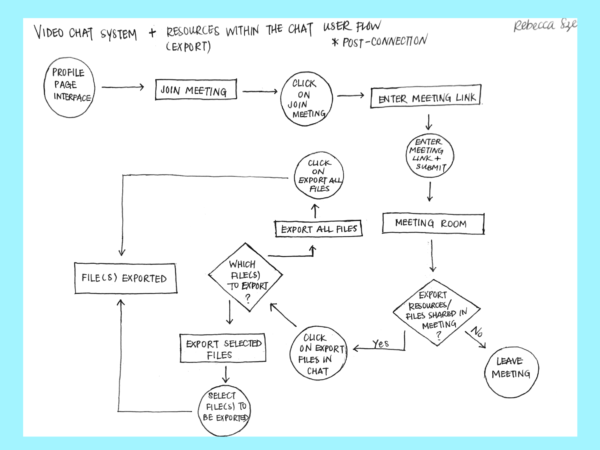
Taking my learnings from my user research (user interview) and research synthesis (affinity mapping and problem statements), the features to be created are determined, and the following user flows are created and turned into first initial sketches (low-fidelity wireframes).
Here are 4 out of the 7 features:
Userflow
Even in the early stages of low-fidelity mockups, I was cognizant of creating multiple routes for the user. Should they deviate from the main path, there’s always alternative routes that would lead them back to the main one.
Sketches
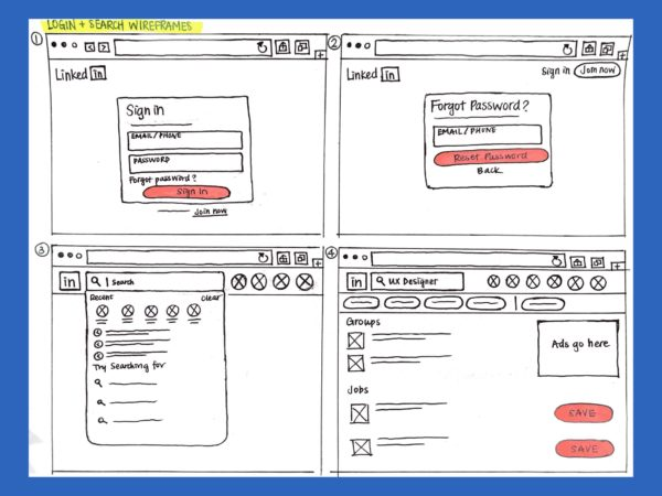
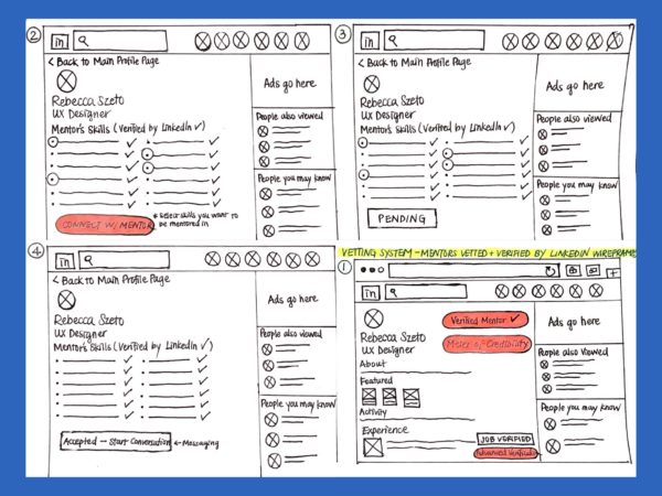
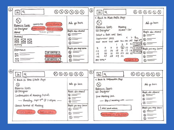
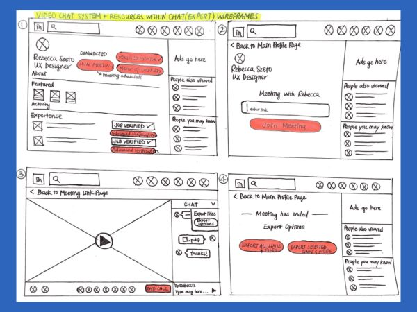
After having decided on the features and flow for each feature, I created low-fidelity wireframes for each feature. They give an overview of the frames included for each flow and where buttons are on each frame (highlighted in red). This shows the general flow of how each frame transitions to the next.
Mid-Fidelity Wireframes
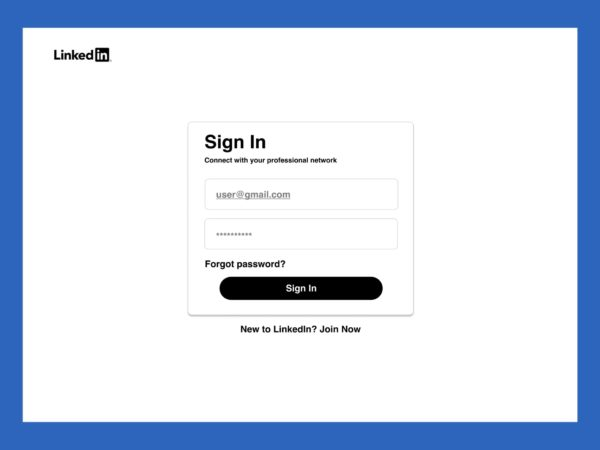
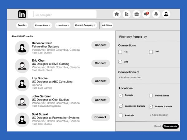
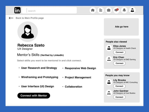
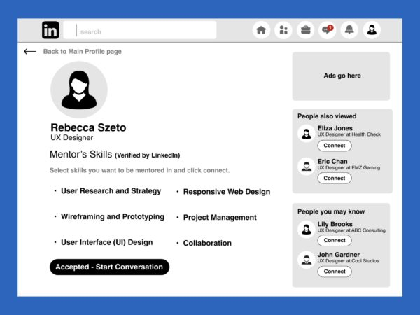
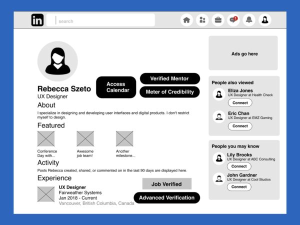
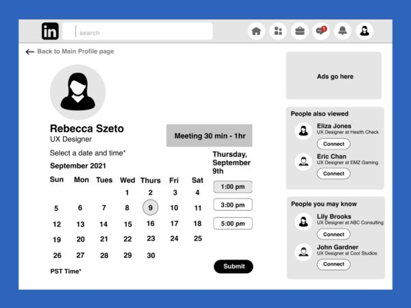
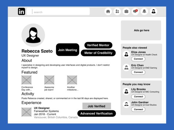
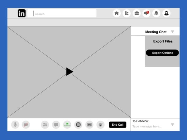
For the mid-fidelity wireframes, I created a grayscale version of all the frames that I drew out in my sketches. These frames all include real content of what would actually appear in the final product with font matching to that which is currently being used on LinkedIn.
I used the column layout for aligning everything. I worked with a 12 column grid with a 15px gutter. (That kept all my frames aligned, but I later realized that it wasn’t scaled to what was actually on LinkedIn’s browser. In other words, my frames were all aligned but they were all blown up – everything was too big. I had to scale everything down to LinkedIn’s sizing later on.)
1st User Testing, Rainbow Sheet Results, and Action Items
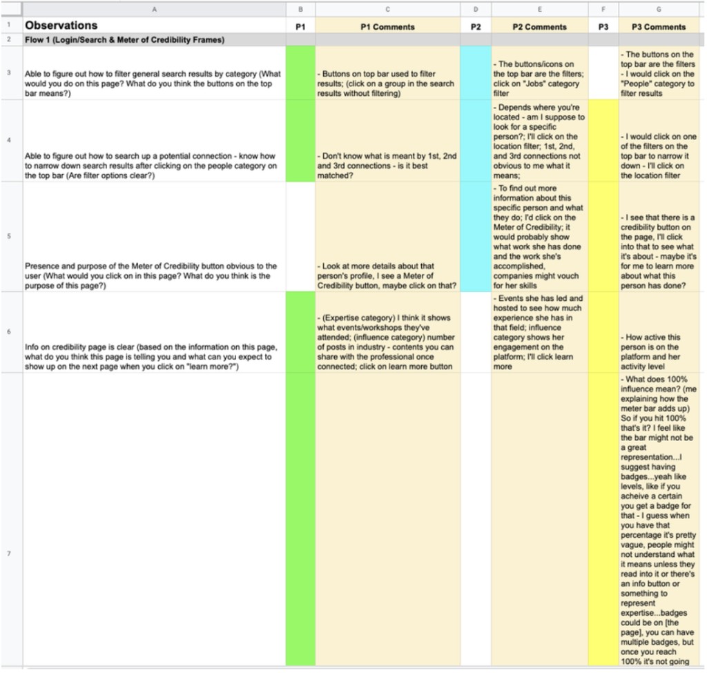
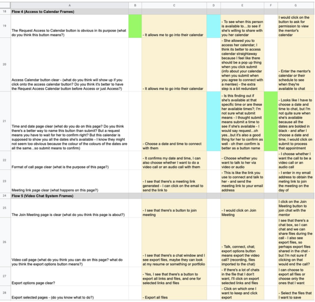
1st User Testing Results
Main Action Items under 1st User Testing
All 3 participants struggled with the first user flow (search wireframes) — they didn’t intuitively filter results by category, even though filter categories exist under the search bar.
- Create an onboarding wireframe series with its own entry point — mentorship becomes a standalone ecosystem on the platform, with a dedicated portal/dashboard on login.
- Keeps users focused on what they set out to find, without unrelated content diverting attention in search results.
- Feature gated to Premium/paid users only.

The Credibility Stats page and its meters were confusing — one participant asked how the percentage adds up, another questioned what a 100% full meter means, and noted that a maxed-out meter might not represent credibility well, or motivate the mentor to keep engaging.
- Replace the meter bar with a badge system, per participant #3’s suggestion — no ceiling means no drop-off in motivation once a mentor “maxes out.”
- Badges clearly state the thresholds required to earn them, viewable on hover/click — transparent credentialing builds user confidence in connecting with a mentor.

Participant #2 found it tedious to return to the profile page every time just to check whether a mentor had accepted their connection request.
- Surface invitation status on the “My Network” page, under a dedicated tab for mentor requests — separate from general LinkedIn connect requests.
- Mentor requests carry selected coaching skills, so they need a distinct look and flow from general connections.

Note: My instructor also suggested to have the booking system within the LinkedIn messaging dm chat itself because it would make the experience more seamless, hence, I changed all the frames to have it in the chat box instead of where I originally put the booking feature to speak with a mentor (that is, the mentor’s profile page). In the 2nd user testing, I learned from all 5 of my participants that putting it in the profile page where I initially had it would be more understandable and make more sense. It was a hassle changing back all the frames for that feature back to its original placement, but it was a learning experience.
Moodboard
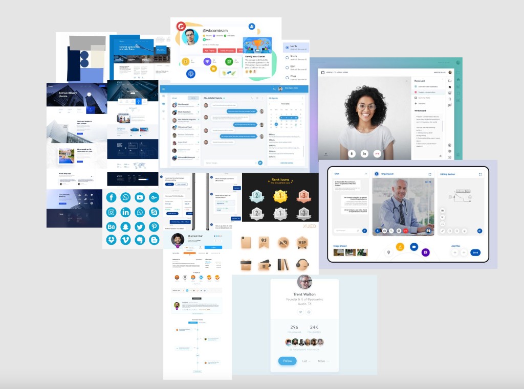
Mood board created to inspire colour palette for overall project and the visual design of features to be built.
Design Style Guide
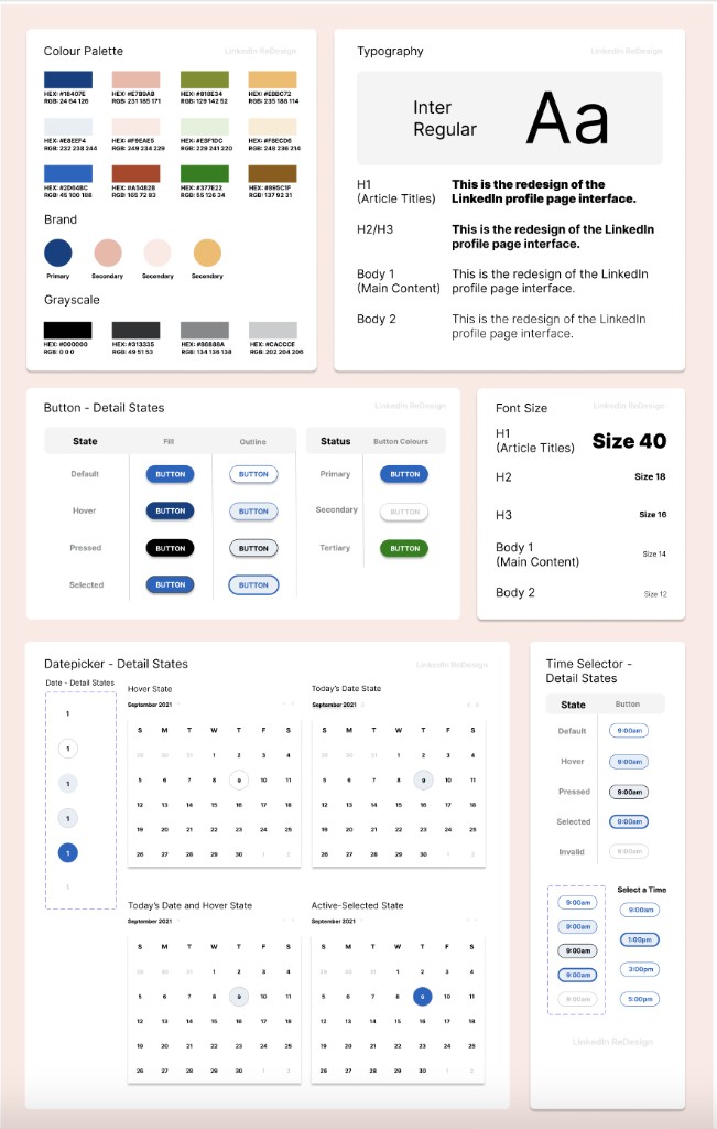
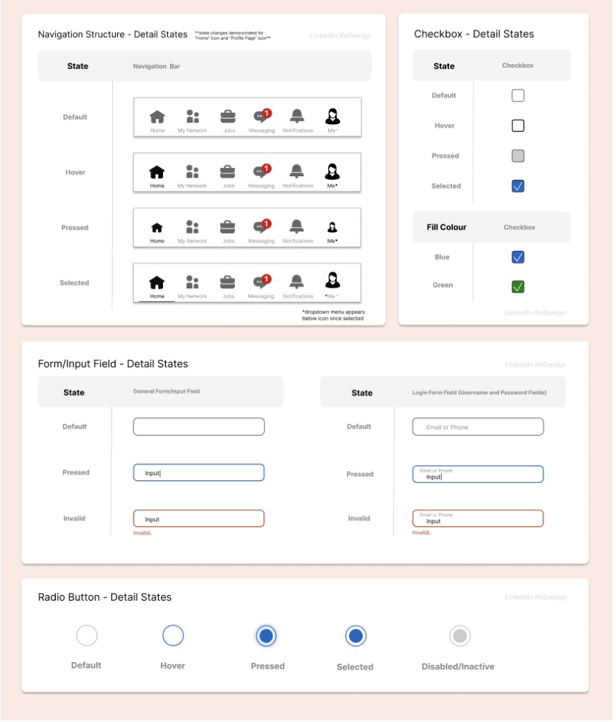
I decided on a colour palette for this project referencing the brand guidelines set out on LinkedIn’s website. Since LinkedIn is currently using a custom font called Community font, I used Inter which comes closest to it.
I also created various detailed design states for when the user interacts with different elements (e.g. buttons, radio buttons, checkboxes, input form fields, etc).
High Fidelity Wireframes
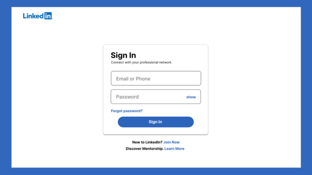
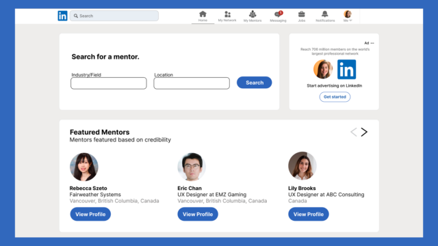
After the grayscale frames, I created my high-fidelity mockups; adding colours (with reference to the Design Style Guide’s colour palette) to everything in the frames and scaling it to be the same as the actual LinkedIn.
I created various detailed design states for when the user interacts with different elements (e.g. buttons, radio buttons, checkboxes, input form fields, etc). Prototypes are also created to show the transition between frames. UI animations are implemented to make the overall experience more seamless and realistic.
2nd User Testing and Heatmaps
All participants found the “Access Calendar” button inside the messaging chat awkward.
- “Why would I go to the chat to search for my mentor when I’m already on their profile page?”
- “I’d be confused whether I need to chat first before I can book.”
- Move “Access Calendar” back to the profile page, where users expect it.

Most participants weren’t sure where to check the status of a connection request sent to a mentor.
Searched the nav bar. Status was nested under “My Network” — most couldn’t find it, or only after multiple attempts.
- Give LinkedIn Mentorship its own icon/hub — distinct branding, less confusion.

Final Screens and Features
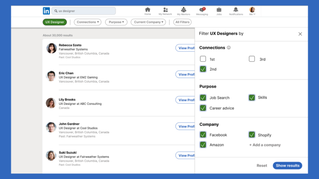
1. Login and Search
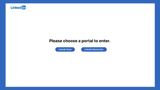
After the 1st user testing, I created an onboarding wireframe series with a different entry point to search and even the mentorship system as a whole could be a standalone ecosystem on the LinkedIn platform. This means that when the user logs in, they can enter a portal and go to a designated mentorship dashboard/ecosystem dedicated for users looking for a mentorship-mentee relationship. This would filter out all other users that are using the main LinkedIn search bar for all other general searches (people (but not a mentor), jobs, groups, etc.)
In this ecosystem, users would go into the ecosystem with a very clear idea of what they want to search – mentors. This ecosystem also helps the user to focus on what they set out to search for without their attention being diverted to other unnecessary content in the search results not relevant to what they’re looking for.

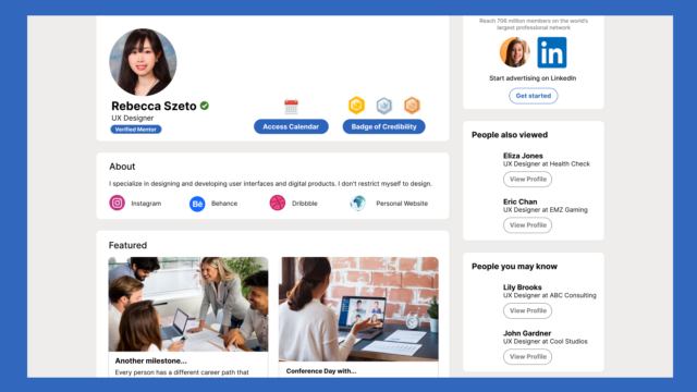
2. Badge of Credibility
(Badge of Credibility based on interaction and engagement)
- There would be a credibility stats page on the LinkedIn professional’s profile page showing how experienced/influential/credible they are through badges
-
A Badge System would clearly explain what thresholds must be met in order for that mentor to obtain that badge – the following are some activities that would contribute to the levelling up in or obtaining a certain badge
- Chat with someone in your field (e.g. If you’re a UX Designer, frequently LinkedIn messaging a lot of other UX Designers on the LinkedIn platform would increase or keep your meter high)
- Attend events/seminars hosted on LinkedIn that’s related to your field/expertise
- Interacting frequently on posts in your industry/field

3. Job/Work Verification System
Job History and Work Experience Verification System (verified by employer/clients on LinkedIn)
To show to the user (the job/career seeker) that the LinkedIn professional is legitimate and that their credibility is being backed by the verification of companies that they have worked for/with currently/previously

4. Vetting System
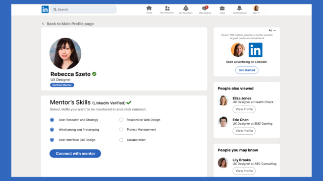
Vetting (Verifying Mentor’s Skills and Credentials) System (Mentees choose skills they want to be mentored in by Verified LinkedIn mentors and send connection request)
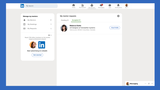
Based on users’ responses in the 2nd user testing, they are more likely to search for a way to view all of their requests than to individually search for a specific mentor via search and view the status (i.e. connection requests) on that mentor’s profile page. (Same for bookings/joining meetings as well).
The iteration would include a My Requests tab under the “My Mentors” icon. By selecting that tab, the user is able to see all connection requests they’ve sent and the status of each (either pending or accepted). If the mentor has accepted, a view profile button would appear next to the mentor, prompting the user to visit the mentor’s profile page where they can book a meeting with them to further the connection.

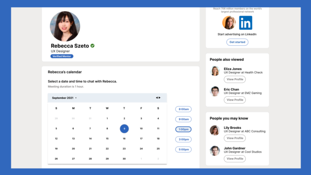
5. Access to Calendar (Primary Route)
Access to Calendar (mentees can access calendar once they’re connected to the mentor)
Users can easily access the professional’s calendar to see when they’re available
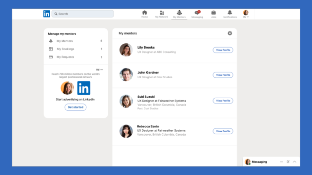
After the 2nd user testing, I’ve created a new set of wireframes to help the user enter the profile page through a new “My Mentor” icon on the nav bar. Once the user clicks on the icon, it’ll take them to a page where it has a list of mentors that the user has connected with and all the user’s upcoming/past bookings. By clicking on the “View Profile” button next to a mentor under the list, it’ll take the user to the mentor’s profile page where the “Access Calendar” button is.

5. Access to Calendar (Secondary Route)
The messaging route path for accessing the calendar and joining the meeting won’t be deleted. Rather, it’ll act as a secondary route for accessing these 2 features.

6. Video Chat System (Primary Route)
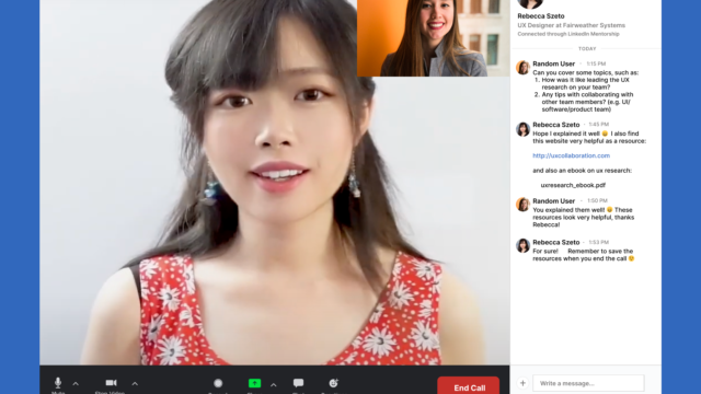
Integrate a video chat system within LinkedIn’s profile page so that the conversation can easily be done with just a click of a button on the interface
Resources Within the Chat (call/meeting)
- Files/resources that were shared during the call/meeting can be exported for the user’s reference later on
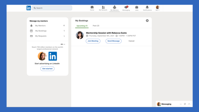
- The user can join the video meeting by clicking on “Join Meeting” under the Bookings (includes all the user’s upcoming/past bookings) tab on the sidebar under the “My Mentors” page.

6. Video Chat System (Secondary Route)
The messaging route path for accessing the calendar and joining the meeting won’t be deleted. Rather, it’ll act as a secondary route for accessing these 2 features.

7. Group Mentoring Workshop
LinkedIn professionals/mentors can host group mentoring sessions where career juniors in the field can sign up for a group chat/meeting right within the mentor’s profile page
This offers a more interactive discussion environment and experience (time and date set out by the mentor)

Final Thoughts
Redesigning LinkedIn’s profile page interface is challenging as that requires exploring a territory that already has so much established – what other problem(s) still exist for users? Figuring that out was the first step, implementing the solution of a mentorship platform alongside all existing features, and ensuring that they coexist in harmony meant constantly reviewing the feedback from participants.
With today’s competitiveness in the job market, a person new to a career field faces many challenges. Through conversations with participants, this redesigned web application is something they see themselves finding useful and actually using.
Below, I’ve listed a few metrics to consider in the future for this project.
KPIs to Track for Real Users Should/When this Product does Launch
Four of these track a mentee’s progression through the funnel; mentor engagement runs alongside it as a supporting metric.
-
Sign-up rate for LinkedIn Mentorship
Gauges whether there’s real interest and demand for the product.
-
Conversion: profile view → connect
Connection is the first step toward a conversation. Tracking it shows whether mentees are actually interested once they view a profile — and if not, why conversions are lower than expected.
-
Conversion: connect → book a chat
The purpose is making conversations happen — this tracks how many actually get created.
-
Conversion: connected mentee → group workshop booking
Group workshops bring the community together — a chance for mentees to meet each other and build continuous interest in the platform.