
Overview
Questwealth Portfolios (QWP) is a product under Questrade (Investing) that offers its customers managed investing services — ETF portfolios handpicked by financial experts/advisors. The purpose of the QWP product landing page is to get more existing customers and new prospects on the website to convert and open a QWP/managed investing account with us.
In this project to redesign the QWP product page, I’m responsible for researching why our QWP Product page has an astounding 80% bounce rate (and a low conversion rate) and to come up with a design optimization solution, especially when the robo-advice market is bound to see a massive market size growth in the next 10 years.
Results
Increased Conversion
~40%
of yearly conversion goal (account openings) reached in just 1 quarter
Investing account growth
31%
of FY24 target reached in Q1
Q1 actual: 56,739 new accounts
FY24 target: 186,000
QWP account growth
37%
of FY24 target reached in Q1
Q1 actual: 6,321 accounts
FY24 target: 16,887
Decreased Bounce Rate
30%
bounce rate after redesign — down from a consistent ~80%
May 1 – Oct 31, 2023
81.77%
bounce rate
Nov 1, 2023 – Apr 21, 2024
36.82%
bounce rate
After the new design for the page was pushed live in December, the bounce rate for the QWP landing page saw a drastic decrease — it went from a consistent ~80% for many months (since Jan 2023 and prior) to a bounce rate of ~30% for multiple months after its deployment.
To make for a fair comparison, I set the 2 date ranges to be a period of 6 months long each (i.e. May 1 – Oct 31, 2023 and Nov 1 – Apr 21, 2024) with the sessions being rather similar (around ~500k each during the time period). Though there is a dip in bounce rate during December, it is also important to note that there were also less sessions/users visiting the landing page during the holiday season — but for the months after, we’re seeing a consistent much lower bounce rate compared to before when we had the old landing page.
The Problem
Performance analytics on the QWP product page — the main homepage for managed investing — showed steep drop-off before conversion, and shallow adoption after it.
Top-of-funnel drop-off
Most visitors leave without engaging
82%
bounce rate
87%
exit rate
Of the few who click “Open an account” (1,285 clicks)
5.72%
became leads
Post-conversion
Investment accounts held per QWP client (e.g. RRSP, TFSA, FHSA)
1.29
Questrade
vs
1.38
industry average
Constraints
No user data
Analytics showed a problem existed, but not why; the challenges outlined are the marketing and product team’s assumptions.
Anonymous website users
Unlike app users, website visitors come and go with no identity or behavioral history to learn from.
Usability testing skipped
Cut to hit the year-end launch deadline for the redesigned page.
Opportunity & Goal
Robo-advising market (AUM), 2022 → 2032
$18.6B → $265.8B
There’s a lot to leverage in that growth, but the QWP product and its homepage are lagging on both page performance (engagement and clicks) and conversion.
Goal — increase engagement and clicks on the OAA (Open an Account) CTA on the QWP product page, and increase conversion of QWP accounts as a product overall.
Assumptions
Fee impact
Canadians don’t know how fees affect their investment performance; high fees lower returns.
Low awareness
Little consumer understanding of what QWP actually is.
Try before you buy
Consumers think switching is difficult, and want to compare results before fully committing.
“I’m not gonna move everything there, but I’m definitely willing to check it out and see.”
Success Metrics
Target Persona
Who we’re designing for
Motivation
Building wealth and retiring comfortably.
Current behavior
Invests at the bank with a branch advisor; unaware of other alternatives.
Switching barrier
High perceived difficulty of switching providers.
Comfort premium
Pays for a professional even when the service isn’t great.
Fee awareness
Doesn’t realize how small fees compound into major long-term impact.
“When it comes to investing – I need a professional to do it for me, I just don’t have the time, skills or knowledge to take that on myself. It’s better to invest with an advisor at the bank, even if it costs me a little bit more and the service is not great.”
Process
-
UX research
-
Collect insights
- Marketing strategy and communications deck — target persona, communication objectives and key messaging
- QWP competitive analysis — benchmarked positioning and feature gaps against Wealthsimple, BMO SmartFolio, RBC InvestEase, NestWealth, Vanguard Digital Advisor, and Betterment
- QWP baselines — traffic and site analytics report: overall and per-page engagement/conversion metrics
- QWP SEO research — top keywords and volume
-
Analyze and sync
Used Google Analytics and Power BI to turn the collected insights into hypotheses and design solutions, then synced the resulting design strategy with the product owner and stakeholders.
-
UX/UI design
-
Low-fidelity wireframes
First draft based on the design strategy; mapped the basic steps in a user-flow/wire-flow.
-
Design sync with stakeholders
Gathered feedback from designers, stakeholders, and product owners.
-
High-fidelity wireframes
Refined from feedback, with additional versions and viewports where necessary.
-
Dev handoff
Answered questions and provided component specs and behaviors.
Research & Insights
After understanding the problem, business, product, and marketing requirements and constraints, I started analyzing the different QWP pages — with the QWP product page/homepage as the primary page to analyze.
- What are users looking for?
- What questions are they trying to answer?
- What are they concerned about?
- What are they hesitant or frustrated about?
Fold exposure analysis
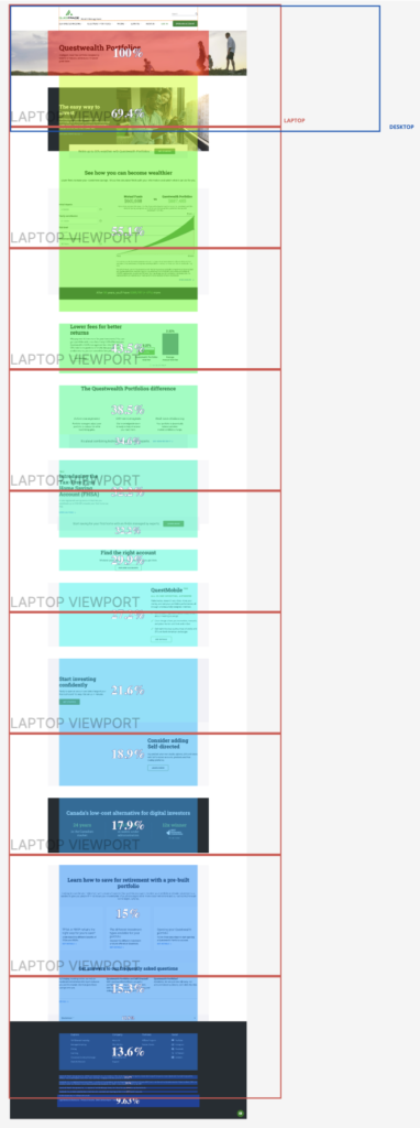
The CTA isn’t visible in the first fold, on laptop or desktop.
Content below the first 2 folds is viewed/exposed at a much lower rate — meaning most visitors may never scroll far enough to see the call to action at all.
Exposure Rate July 1 – Sept 30, 2023 — All users (Desktop & Mobile)
SEO keyword research
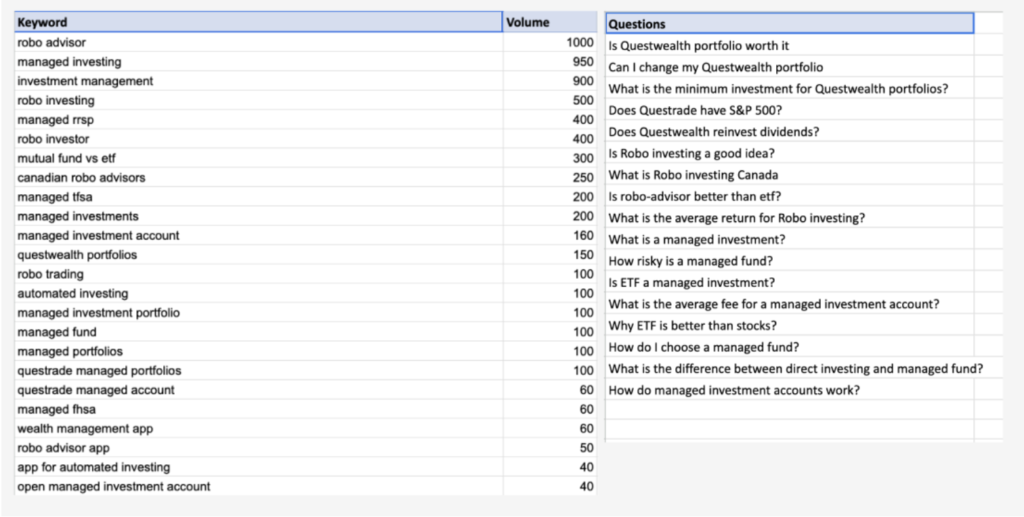
“Robo advisor” and “robo investing” rank far higher in search volume than the product name “Questwealth Portfolios / QWP.”
These are the terms users actually search before finding the page — and the related questions people ask show many visitors don’t yet understand what managed/robo investing is.
From persona to thesis to precedent
From persona
Unaware of alternatives to the bank’s default mutual funds; doesn’t realize how fees add up
Confidence

Competitor example
Fee comparison chart showing long-term value of lower fees
From persona
Pays for a professional even when the service isn’t great — needs someone to do it for them
Trust

Competitor example
Advisor photo with reassurance copy about investing with confidence
From persona
High perceived difficulty of switching providers
Convenience

Competitor example
Simple switch flow, with fee reimbursement offer for moving accounts
Messaging mapped to business objectives
Every marketing message we had to adhere to ties back to at least one QWP or Qcom objective — nothing on the page is decorative copy.
| Marketing message | QWP objectives — “What” | Qcom objectives — “How” | ||||
|---|---|---|---|---|---|---|
| Increase QWP 7% share of assets | Increase QWP assets under management | Higher avg. accounts per client | Attract investors from banks | Guide & educate as low-cost alternative | Acquire leads & prospects | |
| Low Fees | Directly supports (QWP) | No direct tie | No direct tie | No direct tie | Directly supports (Qcom) | No direct tie |
| Portfolios managed for you | No direct tie | Directly supports (QWP) | No direct tie | No direct tie | Directly supports (Qcom) | No direct tie |
| Alternative to Mutual Funds | Directly supports (QWP) | No direct tie | No direct tie | Directly supports (Qcom) | Directly supports (Qcom) | No direct tie |
| Retire up to 30% Wealthier | No direct tie | Directly supports (QWP) | Directly supports (QWP) | No direct tie | No direct tie | Directly supports (Qcom) |
- Directly supports (QWP)
- Directly supports (Qcom)
- No direct tie
From research to hypotheses
Four research inputs converged into three high-level hypotheses — each of which ties back to the pillars of customer buy-in we started with.
Fold Analysis
SEO Keyword Research
3 Pillars of Buy-In
Marketing Messaging
1 Optimize pages for mobile
Bounce/exit rates skew heavily on mobile for the QWP landing page, despite it being the primary destination for paid and display ads.
Ties back to
-
 Confidence
-
 Trust
Trust
-
 Convenience
2 Content isn’t engaging enough
SEO shows a gap between what users search for and our on-page copy, so users bounce once they land and the content doesn’t resonate.
Ties back to
-
Confidence
-
Trust
-
Convenience
3 Distracted derail conversion
The QWP product page has 14 CTAs pulling users toward other sections of the site, disconnecting them from the conversion channel.
Ties back to
-
Confidence
-
Trust
-
Convenience
Design Recommendations
Two frameworks, one structure
We treated the QWP page as a journey in itself — top to bottom mirrors awareness to conversion — then applied the Laws of UX to decide how each zone should be built.
Hick’s Law
More choices, more time to decide — cut CTAs down to one primary + minimal secondary.
Serial Position Effect
First and last items are remembered best — least critical content belongs in the middle.
Law of Common Region
Elements sharing a bounded area read as a group — used to cluster related content.
Awareness
Rec. 1
What QWP is, in the marketing messaging users searched for, plus one primary CTA.
Consideration
Recs. 2–10
Building confidence and trust (and convenience): features, returns chart, fees, testimonials, real professionals managing your money.
Conversion
Recs. 11–14
Account types and one primary CTA, backed by a human option and FAQs to clear final doubts.
Awareness — Rec. 1
Serial Position (first, best recalled) + Hick’s Law (one CTA)
Consideration — Recs. 2–10
Features, returns chart, fees, testimonials, real professionals managing your money.
Law of Common Region (bounded blocks) + Serial Position (lowest-recall content lives here, so it needs to work harder)
Conversion — Recs. 11–14
Serial Position (last, best recalled) + Hick’s Law (account types + human option + FAQ, not more CTAs)
Each of the 14 recommendations is tagged to a Law of UX, the overarching thesis (confidence/trust/convenience), a business objective or pain point, and the journey stage above it sits within.
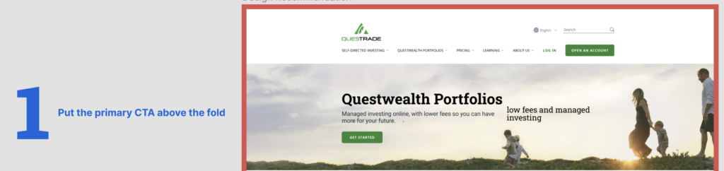
1 Put the Primary CTA above the fold Implemented change The current CTA sits below the fold on both desktop and mobile. A clear action button visible on landing — pointed at a business-driving goal — is essential to increasing conversion.
Before


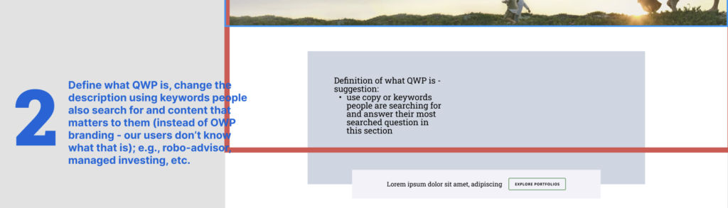
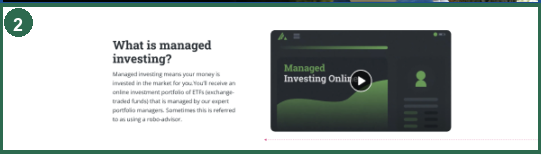
2 Define QWP using the keywords people search for Implemented change SEO research shows people are asking: is robo-investing a good idea, what is robo investing, what is a managed investment. Answering these at the top assures users they’ve landed somewhere relevant.
Before
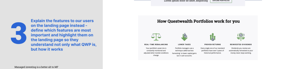
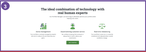
3 Explain features on the landing page Implemented change Users are currently sent to a separate Features page that’s rarely clicked. Communicating features at a glance, in place, is more efficient and more accessible.
Before
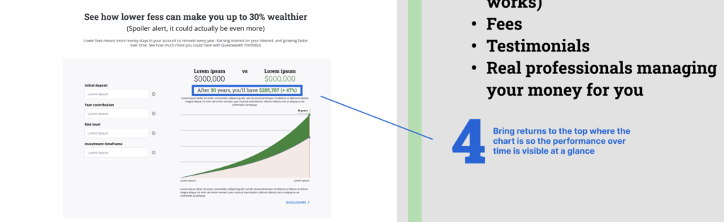
4 Bring returns to the top, next to the chart Make it obvious, right on the calculator, what returns look like over a set timeframe — so users can “try before they buy.” Not yet mocked up.
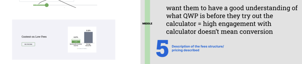
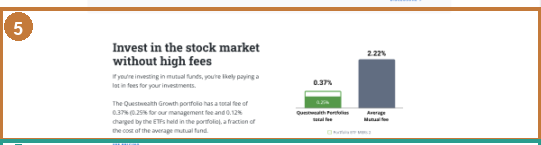
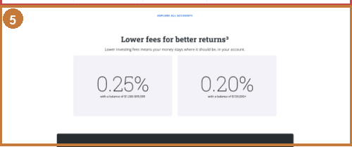
5 Describe the fee structure and pricing on-page Implemented change People care about average fees for managed investing. Redirecting to a separate, rarely-clicked Pricing page is worse than explaining pricing clearly on the product page itself.
Before
6 Add customer testimonials Account Types and related pages have low engagement — customer testimonials that build trust/credibility belong on the QWP product page.

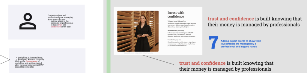
7 Add expert profile A real professional’s face and credentials on the landing page helps build trust and confidence — crucial for conversion.
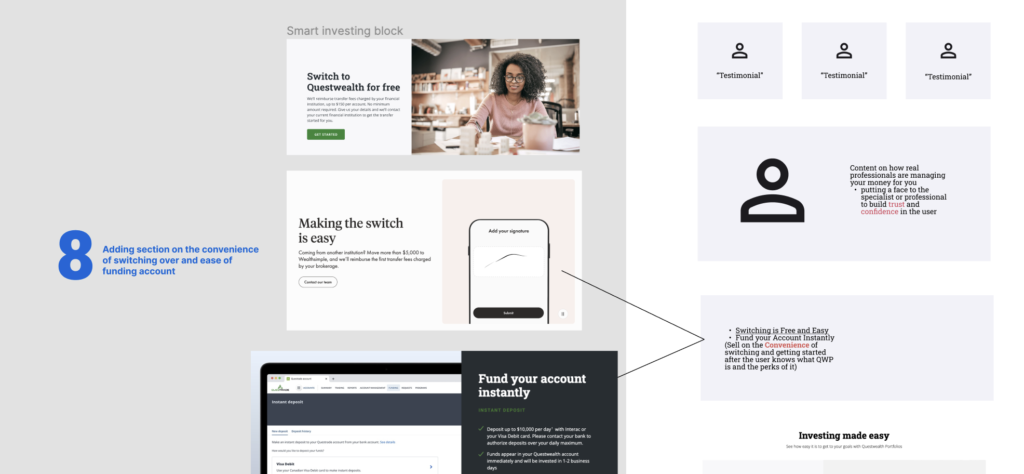
8 Emphasize convenience of switching and funding Communicating convenience is the third part of the strategy. Emphasizing ease of switching makes it easier for users to get started.
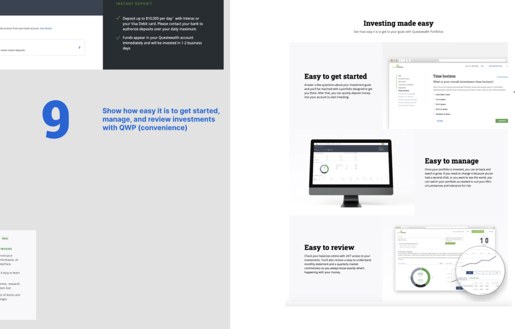
9 Show how easy it is to get started, manage, and review investments Highlight ease of starting and how easy it is for customers to manage investments on the platform.
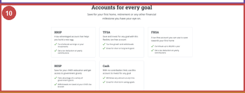
10 Account types at a glance — goal-oriented copy Implemented change Show different account types and features at a glance so users know what they’re converting to.
Before

11 New CTA mentioning combining QWP and SDI accounts Product/marketing asked to leverage opening both SDI and QWP accounts — included toward the end of the page for flexibility.

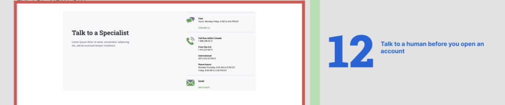
12 Talk to a human before you open an account If a user reaches the bottom with questions, offer a real person over the phone before they exit.
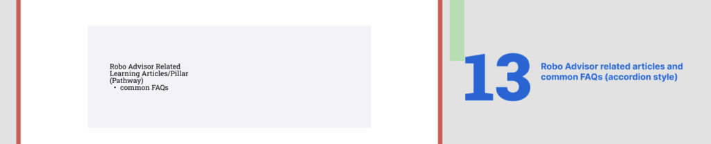
13 Robo-advisor related articles and common FAQs If still unsure, users can visit related articles on account types and managed investing before deciding.
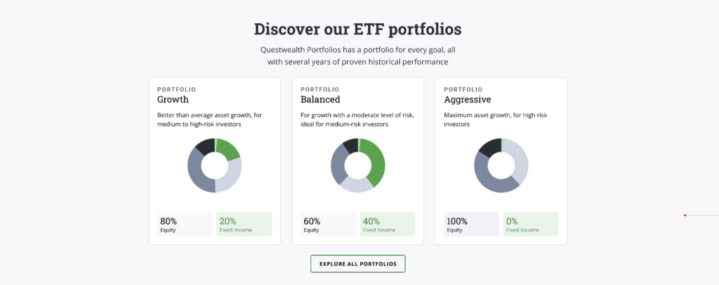
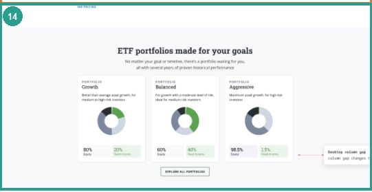
14 Popular portfolios and historical performance Implemented change Outline most popular portfolios and historical performance to show people they can safely invest in their future.
Before
Design Changes
Design changes implemented for this cycle:


- Put the primary CTA above the fold and near the end (Serial Position Effect)
- Define what QWP is using keywords people search for (robo-advisor, managed investing, etc.)
- Explain the most important features on the landing page
- Description of the fees structure/pricing
- Account types at a glance — goal-oriented copy
- Popular portfolios and historical performance
UI work and Handoff
After UX wireframes, UI work starts — component specs (if not in the design system), padding for accessibility, font sizes for visual hierarchy, etc.
-
1. Describing specs and behaviour of new components to devs
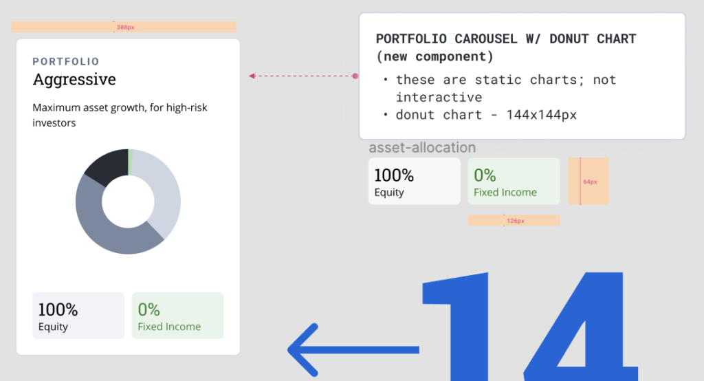
Since the portfolio card is a new component not yet in the design system, including it required clear specs for developers — including donut chart size and static rather than dynamic behaviour.
-
2. Better accessibility — increased padding
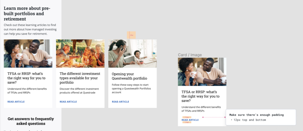
To allow easier interaction (especially on mobile) and better legibility, we increased padding within the learning article card.
-
Additional specs documentation
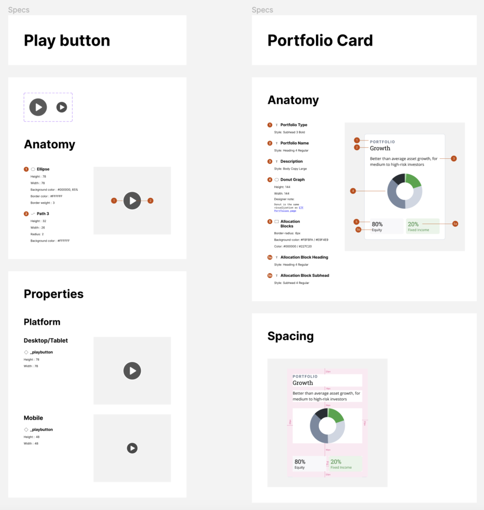
Results
Decrease in bounce rate
Growth in account openings, Q1
Primary CTA click rate
+30% relative lift on the existing primary CTA.
“Explore Portfolios” — new secondary CTA
Beats the typical ~9.5% benchmark for a strong landing page.
A substantial number of visitors are still at the awareness/consideration stage when they land — still educating themselves about the product. Targeting that group with a dedicated exploration CTA gets the start of the funnel right, and the click rate backs that up.
Constraints remain: copy relevancy is owned by the content team, out of scope for design, and organic/paid traffic mix affects these numbers too — so the results are strong given scope, timeline, and restrictions.